
PROJECT 1
ROLE
Principal Designer
SFLY A new creation experience
We were proud of our customer’s 63% photo book completion rate. For a task as time-consuming as making a photo book, the fact that 63% of people who started a book finished it felt OK.
But after some digging, I realized that the average hid a tale of two users. When you searched deeper, you found that returning customers were 84% likely to complete any given photo book they started, while new users completed at a shockingly low 32%! Something was wrong.


What we accomplished:
Seeking insights, we launched a series of new user interviews to understand the source of this disparity. The two things we heard repeatedly were that it “looked too complex” and “I just don’t have the time.”
And they were right. Session tracking data suggest it takes most people 3.4 hours to make a photo book; self-reporting puts that number at over 9 hours.
We discovered two related factors:
The years of features and options had slowly eroded the core purpose of the photo book creation tool. Established customers had grown up alongside it, so each new thing felt less daunting. For new users, the accumulation loomed. It might have been best put by one of our participants who responded with, “it looks like software.” Damning, indeed.
The second factor demonstrates Hick’s Law. Photo books have a lot of customization options. Just about everything can be tweaked, moved, and resized. Layer in all the different styles, backgrounds patterns, colors, fonts, and stickers, and you have a staggering number of choices to consider at every turn. All these options ate uptime and, as we proved in a later A/B test, did not contribute to greater satisfaction with the finished product.
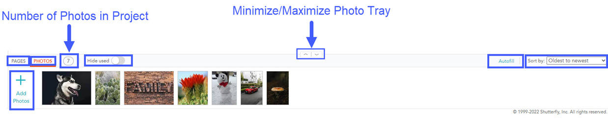
We took these tools and built a UI around the idea that there was only a small number of viable options at any given point. There are a hundred wrong ways to layout your photos, but only a small number of ones people like. We also believed you should never have to sort or organize your photos again manually. Layouts could be recommended, and photo cropping and placement could be completely automated. Utilizing machine learning, we could significantly reduce the number of decisions a user had to make, letting them focus on a small number of meaningful choices.
We began with concept testing, carefully considering the reaction of both the existing customer base and those new to Shutterfly. Starting with wireframes and click-through prototypes, we tried out a lot of solutions. Some things worked, others we threw out. We kept looking for ways to simplify while ensuring the user felt they were entirely in control of how the book looked.
While the UX work continued, we started building out the machine models to power the experience. We reached out to customers and asked them to send us non-curated batches of photos. We would turn these into books and get feedback. All feedback was then poured into the model, improving, debugging, and tweaking.
We had our first working prototype this spring using our proposed UX and an early machine learning model. We conducted an in-depth 31-person research session to understand how our system and UX performed.
We learned a lot and took our findings back to the team. Over the next month, we made changes, tested again, and improved. Every four weeks, we repeated the test. This fall, we launch to the world.
The examples shown are where we are currently, but the project continues to evolve. Please note these screens represent the combined hard work of the very talented design team that I worked with. Their creativity and ingenuity humble me every day.
More Projects


